Communicate effectively
with Data Storytelling
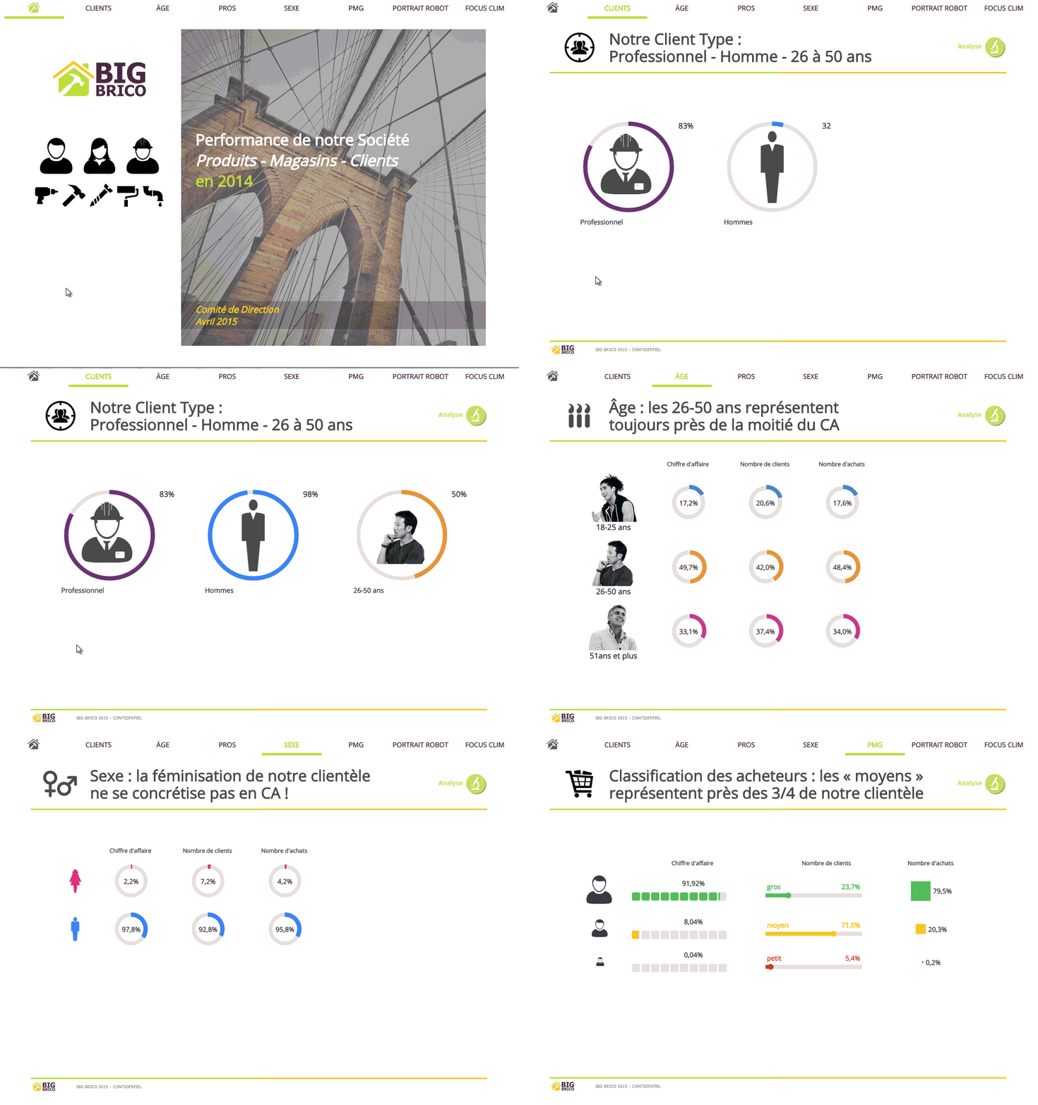
This feature is part of Coheris Liberty DNA. Users can directly create powerful presentations, incorporating interactive dashboards and indicators.
The graphics representation of figures is more efficient, relevant and on-target. It engages your audience to focus on the “story of your data analysis”..
Complementary to Datavisualisation, Data Storytelling is a particularly useful method to captivate and engage your audience and communicate more effectively through powerful graphics.
These two methods are original alternatives to the representation of figures.
Tell a data-centric story with Data Storytelling
Telling a story around your data is the best way to communicate your message effectively and get people to make the right decisions.
Gathering a few dashboards and switching from one to another with a tab system is not enough to create a “story” or an “animated” report. Coheris has designed for Data Storytelling a full-fledged BI tool that has 3 main and complementary features:
- the visualization of data, their play “script” and their “value”, without neglecting the graphics to improve the COMMUNICATION outlook,
- animations and visual transitions, to CAPTIVATE the audience,
- the ability to transform traditional dashboards into true powerful “slideshows” driven by your data, with a data centric approach, to help you CONVINCE your audience.


